The Science Building, circa late 80's/early 90's Photo courtesy of the CNU Archives.
This was originally part of a future post, but it grew a little too big and warranted its own standalone piece. Enjoy!
The Science Building (1984-2011) was undoubtedly the most problem-ridden structure ever built on the Christopher Newport University (CNU) campus. Here is its story. Let's get into it.
The Science Building was originally designed as a 20,000 square-foot building with interior hallways under President Windsor. When President Anderson took over, he threw out those existing plans in favor of a design with outdoor wraparound walkways. The walkway idea, based off of a building at Anderson’s previous college (Columbus State University in Georgia), was a way to build a larger facility. You see in Virginia, the Commonwealth determines the square footage of buildings at public colleges based on the college's needs. For some reason, it doesn't (or at least didn't) count outdoor hallways as part of the square footage. So by putting the hallways outside, the square footage that would have been taken up by interior hallways could be reallocated to the classrooms themselves.
Construction began on the $2.3 million building in December 1981, and was scheduled to be finished in time for Spring 1983 classes. Almost all classrooms had open ceilings (no drop ceilings) to save money. Interior walls were painted bright colors in “an attempt to make a cheerful and fun place for students,” said Dr. Harold Cones, chairman of the department of chemistry, biology, and environmental sciences.
In October 1982, work was put on hold when the exterior panels hanging from the second-floor walkway were noticed to be tilting outwards, with 0.5-2” of difference between panels. Over fears these five-foot wide, three-ton panels could fall, the college hired an independent consultant to look into them. It was determined the panels needed reinforced support before the building could be deemed safe for occupancy. In October 1983, after months of negotiation, the engineering firm that designed the panel’s original support system agreed to pay the extra fees to remove the panels and add additional supports. Construction also hit some additional contract squabbles, pushing the completion date further back. The building finally opened during the summer of 1984, a year and a half late, yet surprisingly under budget.
After its first winter of operation, it became apparent a design choice from Georgia was not going to transfer well to Virginia. The walkways did not drain well, creating standing pools of water or ice (depending on the temperature). Salt was used to melt ice to prevent students from slipping, but this caused hairline cracks to appear in the concrete.
This wasn't the only issue. The treads used on the exterior stairs were designed for interior use only. They became known as safety hazards after students and staff alike kept falling on them. The inside was not without its own faults. The roof severely leaked. The open ceilings led to classrooms being “poorly lit and acoustically ineffective.” Of the building's 28 heating pumps, 24 had to be replaced, while the four remaining required serious repairs.
Christopher Newport first sought to enclose the walkways in 1985, less than a year after the building first opened, but the state ultimately did not award funds for the project until 1994. When it did, the walkways were one of the reason for renovation, but not the main one. That honor went to... the ventilation system.
For a classroom building, the Science Building's ventilation system was sufficient. For a classroom building that frequently held labs working with chemicals and noxious fumes, it was nowhere near sufficient. "The fresh air intake in all of the rooms were dependent on how many times you opened and closed the exterior doors," recalled Bill Brauer, Executive Vice President at CNU. Students and teachers developed headaches and/or nausea if they spent a prolonged amount of time in the building. Mold became a problem. The Captain’s Log reported that “when officials from Richmond came to CNU to evaluate the validity of the school’s complaints about the science building, they had to end their examination early because of adverse physical reactions caused by the building’s poor ventilation.” Dr. Cones described the building as “a real diseased animal.”
The $1.1 million renovation to fix all of the problems began at the beginning of the fall 1995 semester. Students were not happy with the timing, but that was the earliest CNU could work with when they received the money and the schedule thereafter. While the building was closed, science labs were held in trailers and other spaces scattered around campus. The building was scheduled to reopen by January 22, 1996; however, as this was the Science Building, construction blew past that deadline. Contractor communication breakdowns and a little mix of bad weather had taken its toll on the project. Since the January 22 deadline had been written into the contract, the contractor had to pay CNU $1,500 each day construction ran over. The building was finally complete by late spring.
CNU's Science Building, post-1996 renovation Photo courtesy of the CNU Archives.
When students finally got to experience the refreshed building, its air system was finally ready to handle science labs. "The new ventilation system has 1,800 computer controls and utilizes six telephone lines. It now moves four and a half times more air than the administration building," reported Cones. The interior footprint had also been expanded, enclosing the hallways, adding extra faculty offices, and making space for a new entry atrium that could be used as a student lounge. "It definitely changes the lifestyle," said Biology major Stephanie McMorris at the time, "In the old building people would hang out on the patios and smoke. Now it feels like you are in an academic building."
The rest of the Science Building's tenure was fairly uneventful. It worked as it should.
In the late 2000's, CNU started construction on a new generation of academic buildings. Adjacent to the Science Building came Mary Brock Forbes Hall, the new home of integrated sciences. The Science Building had initially been slated to be reused as a wing of this new hall, sporting a new façade that would have fit in with the newer building's Neo-Georgian look. However, a new problem would have arisen: due to Forbes' higher ceilings, its second floor was eight feet higher than the Science Building's. To connect the buildings together, it would have required a ramp connection or another awkward solution. With building materials cheap at the time, CNU realized that they had enough project money to demolish the whole thing and build a new one. So they decided to do just that. The Science Building was demolished over the summer of 2011.
Remains of the Science Building, August 2011
Forbes Hall's second phase opened for the Spring 2013 semester. Like the Science Building before it, it is a two-story rectangular building teaching science. Unlike the Science Building, it hasn't had major problems requiring a major renovation 10 years after it was built.
Forbes Hall's Phase 2 Wing The rest of Forbes Hall and the DSU are to the left
THE END!
Sources: Dozier, Linda “New building added,” The Captain’s Log, 29 October 1981
“Science Building to be completed by Christmas,” The Captain’s Log, 10 September 1982
Helm, Scott “New Building To Be Finished,” The Captain’s Log, 8 September 1983
Murray, Phil “1½ years later, science hall ready,” Daily Press, 26 August 1984
Begalka, Kurt “$208,000 sought to enclose walkways,” Daily Press, 15 March 1985
Jordan, Jennifer “Science building to be renovated,” The Captain’s Log, 11 April 1994
Deloatch, Deanna “Beautiful Building Blues,” The Captain’s Log, 11 September 1995
Stokes, Melanie "Construction or Destruction?" The Captain's Log, 18 September 1995
Harris, Robin “Just a little more time, please,” The Captain’s Log, 19 February 1996
“4.2 H The Mariner, June 1996,” SAIL - Smart Archiving for Institutional Learning, accessed July 2, 2023, https://sail.cnu.edu/omeka/items/show/10371
Bailey, John “The Newer Science Building,” The Captain’s Log, 9 September 1996
CNU's LEGO Gregory P. Klich Alumni House. Image courtesy of Benjamin Leistensnider/CNU
LEGOs are one of my favorite toys. You can build anything with them, create stories, blow everything up, and then start from scratch again! When I was young, I spent many a weekend in my basement playing with LEGOs. As I grew up, I still remained captivated by the bricks. Due to space constraints, it became less practical for me to continue to actively building sets. I shifted to playing LEGO video games and watching the new LEGO Masters competition TV show.
Between April and August of this year, I was furloughed from my job due to the global pandemic. During that time, I did my best to keep sane and safe. I searched for things that would bring me joy. Lots of people seemed to have done the same thing during this time. Some started baking, exercising, or Animal Crossing. Others picked up long-lost hobbies. For me, I picked LEGO building back up. It was a joy I could get sucked into and momentarily forget the problems of the world.
Through internet sleuthing, I discovered the LEGO Digital Designer program, where you can build your own LEGO creations on the computer. Once you design your build, the program is able to tell you how many of each brick piece you need so you can build it in real life!
After I posted a couple of designs on Facebook, I received a message from my alma mater's Senior Director of Alumni Engagement, Baxter Vendrick. For the Christopher Newport University (CNU) Gregory P. Klich Alumni House, he was looking for something that would spark the interests of "kids and kids at heart" on tours of the house. He had seen my creations, and thought a CNU-themed one would fit the bill. So he challenged me to design a LEGO model of the Alumni House.
CNU is rife with Neo-Georgian buildings, an architectural style which is relatively easy to translate into LEGO bricks. Like LEGOs, Neo-Georgian architecture features a lot of straight lines and right angles. If there are angles present, they usually aren't too crazy. I'm not at a skill level yet where I feel comfortable with lots of bends and curves (Sorry Ferguson Center), so this was a project I knew I could do well.
It took about three days to design the first draft of the model in the LEGO Digital Designer program. The design used around 3,700 bricks. I based this draft off of pictures I had already taken of the building and pictures found on the internet/GoogleEarth.
Progress shot creating the first draft of the Alumni House
Once I had Baxter's seal of approval on the first draft, I started refining it to be more accurate and better-looking. I visited campus and closely studied the House to capture the details I had previously missed. Another important feature I added during this time was interior supports -- very important if I wanted the model to survive past the year 2020. The model now had 5,700 pieces.
Before I started building, Baxter asked me what the model's estimated measurements were. The model was 25" x 20" x 12". Baxter got back to me with bad news -- the model was too big. Its intended location was a shelf in the Alumni House's Davis Library. The shelf could accommodate the length and the height, but it was only 12" deep. At 20", my Alumni House was 8" over the maximum possibility. Rather than start from scratch to resize it, I decided to take the King Solomon route: cut the design in half, and only build the front. Testing my hypothesis, I found I could indeed make it work. Everything needed for a complete front-view could be included!
Designed backside of the Alumni House
Once pieces were ordered, the next few weeks were filled with waiting for all the LEGO shipments to arrive. It was like Santa was able to give me the instruction manual on Christmas Day, but the LEGO pieces arrived 2-3 weeks later in January! It was agonizing. Once everything was there, I built the House over 2 days. (By comparison, it took over a year to build the human-sized Alumni House. Watch out Whiting-Turner, there's a new contractor in town!)
Laying the brick foundation
First floor completed of the main block of the Alumni House!
Second floor done, starting on the base of the chimneys and some of the roof interior supports
More tweaking occurred after "finishing" the build. Looser elements were also glued down with Le-Glue.
Finally, it was time to bring the Alumni House home to CNU. Driving with the model was not as bad as I imagined it would be. I placed it in a tray and secured it with a seatbelt. I drove very cautiously, closer to how my mom would like me to drive all the time. All in all, it arrived safely in one piece!
LEGO Alumni House in front of the human-sized Alumni House Image courtesy of Benjamin Leistensnider/CNU
It felt wonderful to slide the model onto its shelf in the Alumni House's Davis Library. Each step of the project had been so much fun for me. And now, that joy and fun will hopefully transfer to all who see the model on tours of the House!
LEGO Alumni House in the Davis Library Image courtesy of Benjamin Leistensnider/CNU
Fun Facts
The model is made of 3,239 bricks!
Backside of the LEGO Alumni House Image courtesy of Benjamin Leistensnider/CNU
The font used on the stickers is "Trajan Pro" -- the official CNU font and the font used on the human-sized Alumni House.
The ship's wheel on the back of the model is a nod to the University seal. It can also spin!
The anchor in the garden out front is a nod to the nautical ties of Christopher Newport and of the surrounding community. Unlike the building, I took artistic liberties with the landscaping. There isn't an anchor in the garden [yet].
Along with my name being on the back, I hid my initials on the inside.
Hidden initials built into an inner wall
I still have the plans for the complete model that includes the backside. They're ready to be used, should the desire ever arise to construct the whole building. Just throwing that out into the ether....
LEGO Captain Chris Image courtesy of Benjamin Leistensnider/CNU
LEGO Chris's cape was originally a blue Batman cape. I cut the bottom so it would be a straight line.
Chris's chest piece and pants are gray because those were the colors of the walkaround mascot's clothes when I played him. Since I've graduated, Chris has received a brand new blue suit.
Acknowledgements
Thank you to CNU Plant Operations for building a plexiglass case for the model! This will ensure the model's safety, cleanliness, and longevity.
Thank you to Ben Leistensnider for the gorgeous photos of the model, and for letting me use them for this blog!
Thank you to Baxter Vendrick for the initial challenge, working through all the logistical issues with me, and supporting alumni wherever you can!
Last but not least, thank you to my Mom and Dad for encouraging my love of architecture and LEGOs throughout my life!
Me and my LEGO Alumni House on the Alumni House Portico Image courtesy of Benjamin Leistensnider/CNU
[This article originally appeared in a late April 2013 edition of The Captain's Log, Christopher Newport University's student-run newspaper. Enjoy this blast to the past!]
A Farewell to Admin
By A.J. Jelonek
It’s been nicknamed “The Power Tower” by those who work in it. An old issue of the Captain’s Log from the 80’s nicknamed it “Windsor Palace,” after the school’s 2nd president who pushed for the building. In more recent times, many have called it ugly. But it has always been CNU’s singular Administration Building.
This summer, the Admin Building will become the last major building of old campus to be demolished for the 2015 campus plan. With its imminent demolition close by, we look back on the place where important decisions were debated and decided.
Before the Admin Building was built, administration services were held in a wing of the Captain John Smith Library. By the mid-70’s, there was a need for more office space on campus. Campus had the infamous “Windsor classrooms,” 12 trailers for classrooms and offices, approximately where the old Science Building was and Forbes Hall’s Phase II expansion is now.
“They were dreadful,” recalls Dr. Mario Mazzarella, a longtime professor here. “There were four offices in one of those trailers. The walls were so thin that I used to joke that if someone sneezed in one end, you’d say ‘Gesundheit’ at the other end.”
The college had recently gained independence from William and Mary, and took the opportunity to have its first major campus expansion projects since the original buildings were built.
On May 8, 1979, a groundbreaking ceremony for the new administration building was held. The Virginia State Governor John N. Dalton was in attendance. It was designed by Forrest Coile and Associates, the architectural firm of all the original buildings on campus.
The building officially opened in December 1980. One major difference from today’s building is the third floor was originally comprised of offices for professors.
When it was built, it was the tallest building on campus. It tied in height in 2005 with the Ferguson Center’s Tower and was finally surpassed by the Trible Library in 2008.
What exactly is its architectural style? Our University Architects are not even sure. The closest match would be Utilitarian. “Some people seem to find it very unattractive; I think it just looks okay myself. I’ve seen worse,” says Mazzerella.
Soon after it was built, there was a plan to build an outdoor stage connected to the side of the building now facing the Great Lawn. It could have been used for performances to commencement exercises. These plan did not come to fruition, so the space was kept open.
Many parts of the building were dedicated over the years. In the mid-80’s, the auditorium on the first floor was named Anderson Auditorium, after the school’s third president, John W. Anderson (1980-1986). On September 15, 1993, the Barclay Sheaks Gallery was dedicated on the 4th floor. Sheaks was a famous local artist who donated a few of his pieces to show his support to the university.
In 2000, the building was the setting of a protest. Teachers and students rallied together when they heard two graduate courses were planned to be cut. As part of the protest, students held a sit-in in the building’s lobby. A compromise regarding the courses was eventually reached.
For the most part through its life, the admin building wasn’t a setting for events. “It’s not a place where big campus events occur,” says Mazzarella. “It was built and served a particular purpose. It’s an office building.”
“It’s a work-a-day administrative building,” explains Dr. Santoro, the school’s 4th president (1987-1996). “Everybody gets there pretty much at 8 o’clock and stays till beyond the closing. That’s a workaholic building, and still is.”
The building has evolved with the times. Different departments have moved in and out. When the building first opened, computers were not as widespread as they are today. Registering for classes meant standing in lines at the Registrar with you and your 4,000 classmates.
With campus building rapidly around it, its utilitarian architecture became a sore thumb to many. Plans were proposed to renovate the building to fit its Georgian neighbors. In the end, it was decided to build a completely new building.
The current building’s demolition will take place in June. The new building, dubbed the Student Success Center, is scheduled to open Spring 2015.
While the old building falls and the new building rises, administration services will be temporarily shuffled around campus to Gosnold, the CNU SunTrust Building, McMurran, and the Library. Some departments, such as Alumni Relations and Admissions, have already moved out to Ratcliffe and the DSU, respectively.
Many of the beautiful pieces of art and campus heirlooms currently held within the building will be kept safe as well. Many items, such as the Virginia state seals above the building’s entrances, will be put into storage for future use. Others, like the School Mace, will be displayed elsewhere on campus (The Mace will be displayed in the President’s Office in the Library).
Like the Gaines Theater before it, the name Anderson will be reused. The lecture hall in the Luter Building will be named the Anderson Lecture Hall.
The Administration Building did its duty to a campus that needed it. It helped CNC and CNU run efficiently for almost 33 years. So we say farewell to the Admin Building. Thank you.
[Since this article was written:
- Demolition work on the Administration Building did begin in June 2013. It was completely leveled by the end of August.
- The Student Success Center's official name became Christopher Newport Hall. The exterior was completed Spring 2015, right in time to be the backdrop for Spring Commencement. The interior would be move-in ready later that summer.
- The Barclay Sheaks Gallery is now located in the Trible Library
- The school's mace is now prominently displayed in the Alumni House
- The Virginia seals are still in storage
-Luter's lecture hall was ceremoniously renamed the Anderson Lecture Hall in January 2021.]
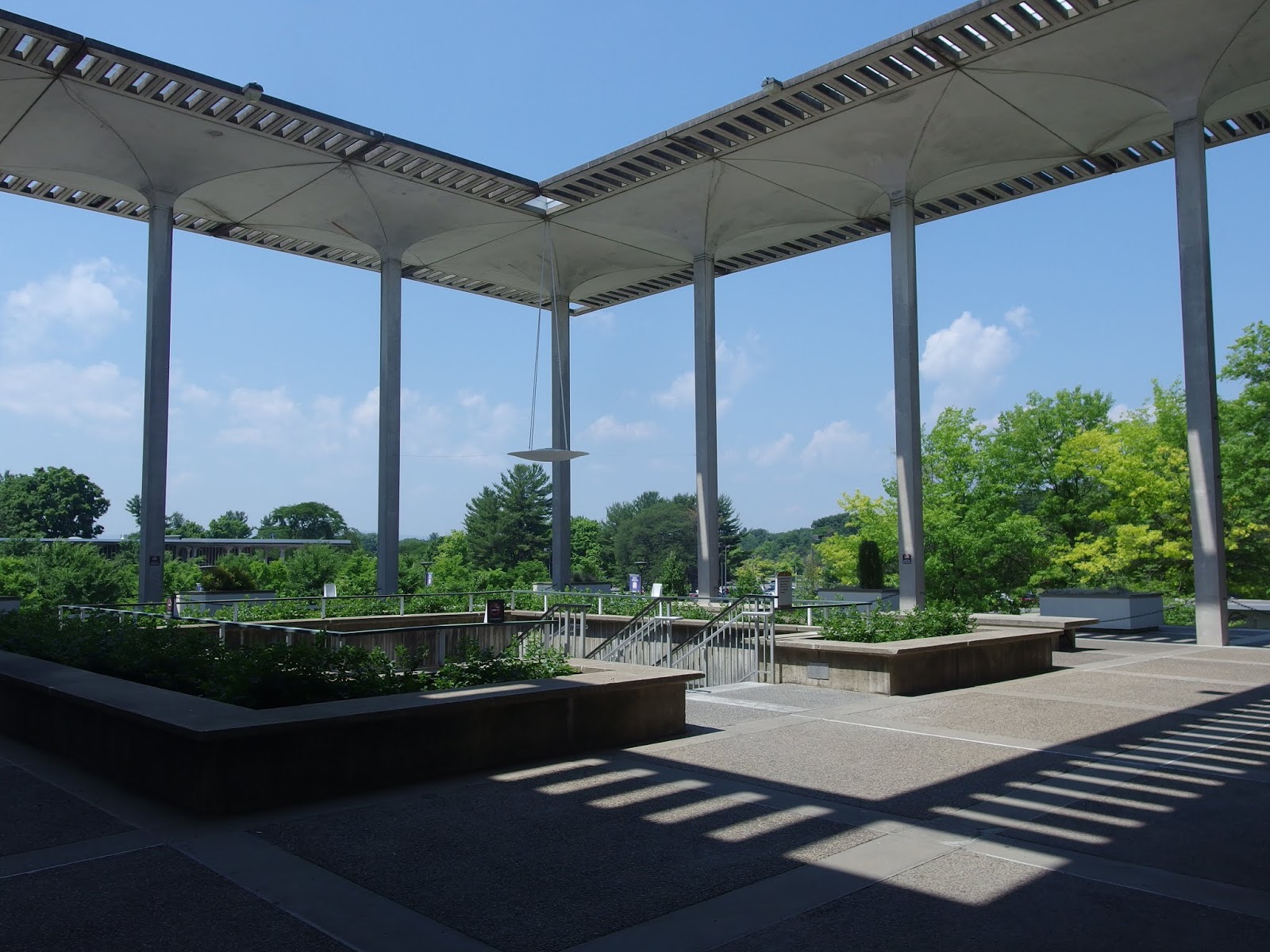
Great minds think alike. I have been an avid Disney fan for over a decade now, so I have immersed myself in much of the lore, including Walt Disney's plans for a city of tomorrow, the original EPCOT. While touring Edward Durell Stone's State University of New York at Albany (aka SUNY Albany or University at Albany), I had this odd sensation it was all eerily familiar. Not just because Stone designed many similarly-looking buildings, but because I kept being reminded of Disney's fabled city. Two massive building projects, one dreamed, one built, but both thought up in the same couple of years. While they do have their differences, I wanted to explore the similarities between Walt Disney's EPCOT and Edward Durell Stone's University at Albany.
Visionary movie producer and theme park creator Walt Disney had plans to build the future. After secretly buying thousands of acres of land in Florida in the 1960's, he publicly announced his plans to build a new complex. Along with a Florida theme park, Disney proposed an Experimental Prototype Community Of Tomorrow, or in short, EPCOT. This would be a testing ground for new kinds of city living. New technologies would be tried out in a planned, controlled environment, meant to make the lives of its citizens better. If an experimental technology proved successful in EPCOT, then it could be deployed to regular cities around the world, benefiting everyone. A great, big, beautiful tomorrow was just a dream away.
A radial city design was chosen upon. In the center would be a skyscraper hotel and convention center, the city's "weenie" (Weenie is a Disney term for a visual icon that draws people towards it, like Sleeping Beauty Castle or Spaceship Earth). The central skyscraper would sit on top of an urban center that contained shopping, pleasantly-arranged office high-rises, and a transportation hub. Hugging the urban center would be high-density housing complexes. Surrounding that would be a greenbelt. The greenbelt, while having plenty of green space and ponds, would also have athletic fields/stadiums, schools, churches, and space for outdoor fairs/events. Beyond the belt was the last ring around the city, low-density residential areas. This final area could be expanded farther out as needed.
Transportation would make up the backbone of this city. Cars and service vehicles (undesirable elements) would be relegated to underground tunnels and perimeter roads surrounding the city. Residents would use different paths that would be open to electric carts, bicycles, or walking. To reach further areas of the city, residents could ride the PeopleMover (continuously-moving, automated transit trains) on elevated rails. From the urban center, PeopleMover tracks would reach all the way out to the low-density residential areas. Monorails would also factor into the design, linking the city with other areas across the Disney property.
After Disney's death in 1966, Disney's heirs tried to live up to the grand plan as best as they could. While creating a literal city was off the table, the Disney Company instead infused many of the city's ideas into the Florida property. The Magic Kingdom was built over tunnels that hid utilities, service areas, and employee transportation around the park. Many utility systems across the property were state-of-the-art and/or experimental when built. Monorails were the flagship transportation system for the property, and the PeopleMover made an appearance as a park attraction in The Magic Kingdom's Tomorrowland. The 1983 EPCOT Center theme park (now named Epcot) was built to be closer to a permanent World's Fair than a living city. It originally showcased future technologies and different cultural communities from around the world, all through the magic of edutainment. The Disney Company would eventually create an unicorporated town named Celebration. Celebration proposed some new ideas for better ways of living, but had more in common with a livable theme park than EPCOT. The Disney Company will probably never create Walt Disney's EPCOT.
Now, let's pivot. While Walt Disney was planning out EPCOT, acclaimed architect Edward Durell Stone was building one. We could call it an Experimental Prototype College of Tomorrow, or in short, the University at Albany.
The University at Albany campus had been situated in downtown Albany. Thanks to increased enrollment, it was looking to expand itself to accommodate more students. Unfortunately, the campus was completely landlocked in its downtown area. A former golf course outside of the crowded downtown was chosen as the site of the university's new uptown campus location. Edward Durell Stone was tasked with designing it. With virtually a blank slate, he could build his idea of the perfect college campus.
Ground was broken in August of 1962. 13 academic buildings and 36 dormitories were built to accommodate up to 7,500 students. The academic buildings would all share the same foundation, an elevated platform called the Academic Podium. For the fall semester of 1964, some students were able to live in recently-completed dormitories. However, it would be 2 more years before the uptown campus started holding classes, and 3 more after that before the campus was finally finished. The project stayed on schedule and under budget. Because Stone was building a complete college campus all at once, the college had a unified look and layout. It was an urban planning feat on many levels.
As I said earlier, both the Albany and EPCOT projects share many similarities. Even though Albany is set up as a rectangle instead of as a circle, it still features specialized rings like EPCOT. In the center of the campus is a courtyard with a fountain and a 251-foot pillar, the weenie of campus. The inner ring of buildings surrounding the courtyard are all focused on campus community and culture: the Library, the Campus Center, and the Performing Arts Center. The next ring, which follows along the perimeter of the Podium, focuses on classrooms and department offices. Once past the Academic Podium are four dormitory quads, each one by the Podium's corners. Around and beyond the quads is campus's own "green belt," including athletic fields, parking, and open fields and forests.
Public transportation was not a huge factor of the Albany campus. Stone, however, shared Disney's disdain for cars. Shortly after the campus opened, Stone told a student interviewer, "Nothing is more fatal to architecture than to have buildings located in a parking lot." The University at Albany would be a walking campus. Parking was relegated to the edges of campus. In creating the Academic Podium, Stone also created service tunnels underneath the main thoroughfares, like those that were planned for EPCOT. This was so auxiliary service functions could still take place.
Both projects have a minor focus on green spaces. One cannot simply build urban expanses -- there needs to be a balance of nature and the constructed environment. EPCOT had its greenbelt, with "a broad expanse of beautiful lawns and walks and trees" (EPCOT film transcript, The Original E.P.C.O.T). Trees and shrubs were also drawn throughout the concept art of EPCOT's shopping areas. At the Albany campus, Stone scattered planters and green courtyards throughout the Academic Podium. Off the Podium, there were plenty of trees and green spaces. SUNY Albany's landscape was designed by architects Clarke & Rapuano.
Aerial Photograph of the University at Albany in a hallway
at the University at Albany.
Even looking beyond what was built, there are many similarities between Disney's city of tomorrow and colleges in general. College is a training ground for the mind, experimenting with new and thought-provoking ideas. It helps grow students into the thinkers and dreamers of tomorrow, which they could then theoretically shape the world around them for the better. Disney's marketing focus for EPCOT was on being a training ground for technologies, but that isn't to say EPCOT would be limited to only one outlet for finding a better tomorrow.
Another similar aspect of EPCOT and colleges is the control. For EPCOT, Walt Disney wanted absolute control over everything. He successfully had the State of Florida give him municipal jurisdiction over his land (something Walt Disney World still benefits from today). He also wanted all the citizens to rent, so no one would own the property. By not owning property, they couldn't vote on changes in the city. Disney would be free to switch out technology in homes as he pleased. Colleges can also exert this force. Students rent dorm rooms, and don't outright have a say in college operations. It is at the will and discretion of the college administration for how much impact a student government can have. This is why some colleges have dry campuses or impose curfews. At the end of the day, a college/Disney has the final say.
There are still differences in the plans. EPCOT was planned to be much larger than SUNY Albany. EPCOT was envisioned to have 20,000 residents, while Albany was designed for 7,500 students. While Albany can get away with not having transportation systems, EPCOT's size alone necessitated it. EPCOT was also going to have many differing architectural styles. While a majority of EPCOT's buildings would use then-contemporary styles, the indoor shopping area below the hotel would use older ones. Called the International Shopping Center, every section would be themed to a different locale around the globe (This grew from the idea of adding an International Street at Disneyland, and later manifested as World Showcase at EPCOT Center). At Albany, Edward Durell Stone had his signature style, and all of the original campus followed this one aesthetic.
Both Disney and Stone had plenty of urban planning experience and knowledge. Edward Durell Stone was a studied architect and had years of experience. He also had a natural knack for layout and finding a simple solution to complex spacial requirements. By the time he designed the Albany campus, he had designed a couple hospitals, hotels, and college master plans. For Disney, Disneyland was praised by urban planner James W. Rouse as the "greatest piece of urban design in the United States." The Disney Company thought so as well; to date, they have copied and adapted the original park's design for five other theme parks around the world. Once Walt Disney came up with the idea for EPCOT, he did a lot more research into urban planning before he reached the plan we know today. I think the fact that these plans are so similar, it does give Disney a lot of credit for his urban planning talents.
I don't believe these men had much interaction together, if any. I can't seem to find any mention on the internet of any Disney/Stone connection. For the 1958 World's Fair, the Disney attraction Circarama was part of the United States pavilion. The pavilion complex was designed by Stone, so it is very likely they exchanged correspondences. Any possible evidence of interaction would probably exist in either the Disney Archives and the University of Arkansas' Edward Durell Stone papers.
I'd like to conclude. Walt Disney and Edward Durell Stone were brilliant men of their time, and did amazing things in their fields. Many people bemoan that Disney's city of tomorrow never got to see today, but I believe a close-cousin version of it was built just up the road in Upstate New York.
Courtyard view from the Futterer Lounge in the Performing Arts Center.
[Full Disclosure: I am a current employee of the John F. Kennedy Center for the Performing Arts. Any opinions expressed below about the Kennedy Center are my own personal views and do not represent that of the Center, its management, or its staff.]
This campus. Wow.
It is so huge. The Academic Podium is 580 feet wide and 1,540 feet long (To compare, the podium that the Kennedy Center sits upon is around 690 feet long). I thought the Kennedy Center's colonnade was long -- Albany's go on forever. And that's not all, this entire campus covers 360 acres. It's sprawling! This is not a campus for those who hate exercise.
Looking down from one end of the colonnade
to the other at SUNY Albany.
I see this as a visually stunning campus featuring a great layout, but the logistics and the realities the design faces undermine it.
It is amazing to stand in the central courtyard and be surrounded by the Stone aesthetic. It's a lovely feeling that everything goes together. Not many architects get to shape a whole environment of buildings. The repetition of elements becomes a strong architectural statement.
That all being said, wayfinding is difficult when everything looks the same. To help people out, maps and signs are posted everywhere. This ultimately leads to a cluttered look. It's frustrating to see buildings age in this manner. I feel if architects want to control this better, they either have to make their layouts ridiculously simple, or build in more wayfinding tools/directional signage. Stone did have some wayfinding built in, but it needed more. A college where everything looks the same is inherently going to need more wayfinding tools than a college that has architecturally-diverse buildings.
Stone made the Academic Podium have covered paths so that students could walk outside in any type of weather. Nevertheless, New York winters can be brutal even without precipitation. You still have freezing temperatures and wind (which the colonnades are known to enhance). The utility tunnels, envisioned exclusively for service vehicle use, are now also used as pedestrian walkways. It feels like there was some misunderstanding of the local weather when the complex was being designed. It's a great campus, but this design would have been better if built somewhere warmer. While there are enclosed pedestrian-only paths built into the design, more of them would have improved campus usability in the winter months. This would have also ensured that the utility tunnels could remain exclusively auxiliary.
Utility tunnel at University at Albany. Big pipes!
The pedestrian path is on the right-hand side,
denoted by the yellow line.
Maintenance across the Podium varies. The more important locations are better taken care of than the off-the-beaten-path walkways and quads. This is even more apparent because everything looks the same. If one section's quality of care is at a lower level than others, it will stand out.
Landscaping also has struggling patches. I have found at a lot of places I have visited, landscape maintenance is seen as an afterthought, or is piecemeal. I believe that this is an incorrect way of thinking. Landscaping is just as integral to the experience as the building is. Modernist and Brutalist buildings don't always look good standing on their own. A little greenery can break up the starkness. It can make a place feel more alive. I think Albany should invest in a landscaping master plan.
Even if there are new plantings here, can anyone explain the
placements of the larger plants and rocks in this planter?
The two large courtyards on either end of the Podium, however, were well planted. I was especially surprised and delighted looking down one colonnade and seeing what looked like the edge of a forest growing inside the Podium.
Look at that forest! (I took a lot of shots down
the colonnades.)
Looking into a lush courtyard
I wrote earlier how I enjoyed campus's architectural cohesiveness. This does not include almost all of the expansions touching the Academic Podium and in close proximity to it. They stick out like sore thumbs. They either vaguely try to be similar to the original design, or do whatever they want. For such a highly-stylized campus that started with such a strong architectural identity, why would you add something that doesn't go along with the rest? It takes away some of that power.
Colleges, heed my words. You don't always need that new contemporary architectural style on campus. If your campus already has amazing architectural cohesion, fight against the temptation for that different style. It will all be worth it!
The one slight exception I found for an expansion was University Hall. This administration building, built in 2006, is right next to the main entranceway to the Podium. It is this wavy-mirror structure that is set on an angle from the Podium. It is intentionally not fitting in with Stone's design, while reflecting his design in its glass. I can grudgingly appreciate that. My only wish is that the building on the other side of the entranceway mirrored University Hall. Instead, the Massry Center for Business was built in 2013 with a different look.
University Hall (Left), Stone's SUNY Albany (Center),
and the Massry Center for Business (Right). I barely took
any shots of the expansions, I was not having it.
I have a lot of strong criticisms for this campus, but I don't want that to bury the fact that it is beautiful and I did enjoy walking around it.
Stone's style is on full display here. There are overhanging eaves with cut-outs everywhere. Hanging circular planters are present, but serve more as lighting than for holding plants. I even found some metal grillework in the central courtyard with a decorative pattern!
Fun grillework cover!
The columns are always the main stars here. Again, I really like that melting column look at the top. When there are rows of columns running parallel to each other, it creates this modern Gothic/Islamic architecture vibe.
Columns melting into the entranceway's ceiling
Another opportunity to give you a
looking-down-the-colonnade shot,
featuring the ceiling.
I have never seen anything like the columns in the library. One part melting column, one part sunburst light. They're a little strange, but I really like them. They seem like a maintenance nightmare, plenty of individual strands were out. It was a challenge to find a completely lit column to photograph.
Loved this aisle
Example of a column with unlit strands
Rare shot of two columns next to each other
all lit up
Sunburst Columns everywhere! It's really lovely.
The main fountain in the central courtyard is of note. It is a lovely, relaxing oasis on campus. The day I visited was very hot, so other people were sticking their feet in the water to cool down. The fountain was renovated 2012-2014, with a new jet design and walkway bisecting the pool. The renovation was designed by Stone Architects, LLC, led by Hicks Stone, Edward Durell Stone's son. Its use of angled lines give off its younger age, but it does very much fit in with the original design.
Central Fountain
I liked the boxed trees along the perimeter of the Podium. They reminded me of the ones that used to surround the Kennedy Center.
Boxed trees!
The Performing Arts Center was closed when I visited, so I have no comments on those spaces.
The 251-foot pillar in the central courtyard is actually a water storage tank with a carillon on top. It was awarded "Steel Tank of the Year" in 1968 by the Steel Plate Fabricators Association for being utilitarian and beautiful!
The prettiest water tower
I visited one of the four dormitory quads, the Colonial Quad. The quads are two stories tall (as opposed to the Academic Podium structures being three stories tall). In each of their courtyards is a 22-story dormitory tower.
A corner entrance to Colonial Quad.
The paint on those columns is ROUGH.
The two-story dorms match the style of the Podium. The towers are very bare & unadorned, which is unfortunately par for the course of Edward Durell Stone tower structures. They copy the wall façade used throughout SUNY Albany. Did not get to go inside any of the dorms, but peering through a window, the rooms look pretty college-standard to me.
Base of the tower. Accessibility is addressed through long
& short-term solutions. Being added in retroactively, the
ramps do not blend in well with the original design.
Corner Dorm Room
It's hard to find a bad angle here. Campus is really photogenic.
Corner of the Academic Podium
Looking at the entrance to SUNY Albany, featuring post-Stone water features
My final thoughts: Visit the University at Albany during the summer when everything is green and the fountains are on. Wear comfortable footwear to walk in. Soak in the Stone aesthetic while dipping your feet in the central fountain. You don't need to look at the expansions, you don't need to enroll/live there. Just get lost in the Academic Podium, and enjoy this architectural gem.
Claremont School of Theology's Colwell Building
Designed by Edward Durell Stone
I took a vacation from the Edward Durell Stone masterpiece I work at, and visited some of his other works in the Los Angeles area. It was like I never left!
Washington, D.C. only has three Stone buildings (The Kennedy Center, National Geographic Society Building #2, and Georgetown University Law Center's Bernard P. McDonough Hall (which has since been renovated)). Los Angeles is full of them!
I had a lot of fun viewing these works in person. You can read all the books and see all the pictures, but I have found nothing can compare to experiencing a site in person. I went to a total of 8 of his designed environments, here's a review of my favorites:
Stuart Building (1958)
The Stuart Building
The Stuart Building, originally a pharmaceutical lab, has been converted into apartments and a community theater [The theater section was closed during my visit]. The lobby and grounds have been lovingly-restored to their original look. The old lobby now functions as the leasing office.
Stuart Building lower lobby
This was my first time experiencing a Stone building that used his New Delhi-style grillework, so I was pretty excited. This grillework design was a particular favorite of Stone's. He would use it numerous times, covering his buildings in it. Here, the grillework hides private office balconies and unifies the front of the building. I can see its appeal. It is simple, yet busy/full enough to block the view of the other side.
New Delhi grillework! Those dull brown
circles in the corners are gold when polished.
Along with the grillework, the front facade is interesting in that there is no building behind half of it. The ground sinks down to a swimming pool. It creates this modernist environment protected from the outside world (Which is fair, the view it hides is of a generic shopping center).
Stuart Building facade and pool
In the lobby, they have wall displays on the history of the building, from its creation and neglect, to its restoration. They took its historic preservation seriously, and it paid off. It looks fabulous.
They're really serious about that historic preservation.
Sprinkers in the ceiling were introduced during its restoration. I initially took them as an original design feature until I looked at some old photographs. They were blended in quite nicely.
Sprinklers in one of the ceiling's intersection points
The placement of overhanging garden planters, lit orbs, and the custom pill-shaped wall design pattern give the lobby a touch of spontaneity, whimsy, and freshness. This follows outside with the eccentric column embellishments. It's an enjoyable feeling to come from a Stone building.
Planters hanging in the lobby.
Columns out front. This building also "floats"
The Stuart Building is a pleasant building and I love how easily it seems to have been re-purposed. If I moved to Pasadena, I would definitely consider living there.
Beckman Auditorium (1963)
Beckman Auditorium
The Beckman Auditorium is at the California Institute of Technology (Cal Tech), the setting of The Big Bang Theory. Terrible comedy sitcom aside, the actual campus is GORGEOUS. The campus has a mix of beautiful buildings from many different architectural eras, surrounded by lots of foliage. The slightly hilly campus lends itself to a man-made stream running between buildings. There's even a turtle pond! It sounds unreal, but it's everything I would ever want on a college campus.
Prominently placed at the center of campus is the Beckman Auditorium. The word most apt to describe the building is "Cupcake." It's a delicious building, inside and out.
The exterior hanging lights remind me of balloons.
It features probably my favorite Stone columns. They seem to stretch and melt. The building's overhang has half-circle cutouts instead of Stone's regular rectangular ones. I like how this change reiterates the shape of the building.
There's a lot of outlines on this building. Diagonal lines crisscross the main exterior. The top of the column's shape is repeated to the left and right of each column on the overhang. The cutouts are outlined. The roof is covered in dots grouped together to outline a larger circle. It's a tattooed building!
Always look up! Beckman Auditorium
After passing through the lobby, you enter the nucleus of the building, the auditorium itself. The auditorium is one of Stone's more lavish. It's very similar in design to the Kennedy Center's Opera House, yet on a smaller scale. Here is Stone's circus tent design in a circular hall with billowing walls and ceiling. The color palette incorporates some of Stone's favorite colors: White, gold, and red (red is featured on the seats and carpet).
Interior overview of Beckman Auditorium
That golden meshwork ceiling is an unforgettable centerpiece. There are lights scattered above the mesh that twinkle on and off. It couldn't get more perfect than that.
Golden Ceiling of the Beckman Auditorium
Every surface inside has a pattern. They're very unusual patterns and shapes for Stone to use.
Thin, white grillework walls
The balcony railing cover and meshwork ceiling.
Is it too sweet? For such an architecturally-varied campus, it doesn't seem to fit in well with its surroundings. Maybe because it is a circle with a pointed roof in a sea of rectangles with flat and gable roofs. Maybe because it is flanked by two matching gloomy brutalist buildings. Who knows. All I know is, I always have room for dessert when it involves the Beckman Auditorium.
(The previous night, CalTech had been simulcasting the
Saturn Orbiter Cassini's Final Moments)
The Beckman Backside!
Edward T. Foley Building (1964)
Edward T. Foley Building
The Edward T. Foley Building is located on the lovely Loyola Marymount University campus. It holds the Strub Memorial Theater, as well as the school's drama department offices and classrooms.
Shapes dominate the building's exterior. Painted circles cover the building's concrete pathways. The building is very boxy. Hexagons cover the walls, and are the shape of choice on this building's overhang cut-outs. The whole exterior reminds me of latticework.
Shapes and Columns - Edward T. Foley Building
The column arches are an interesting choice. They make me feel uncomfortable. Are they really able to hold up the roof? Many New Formalism buildings have columns that expand towards the top, but everything's filled in. Even though their chosen form is different from the norm, their solidity is reassuring. Here, there's negative space, and the columns are not directly under the points of the roof they support. I am not doubting their strength, them standing since 1964 is proof enough. It just feels wrong to me. Maybe because I am not used to this.
The entry shares the same design as the Kennedy Center and the Beckman Auditorium. It is a glass entrance with windows rising all the way to the overhang level. The whiteness of the building emphasize the blackness the windows appear as during the day. It definitely helps to make the door stand out so there is less confusion how to get into the building.
The lobby is a small oval. It's hard to photograph in one shot. It contains a huge religious mural and curving staircases on either side.
Foley Lobby
Edward T. Foley Lobby Mural
The Strub Memorial Theater inside is pretty small. It's also the most unremarkable Stone theater I have ever been in. I did enjoy the circle motif in the ceiling, which harkens back to the perimeter paths' pattern. Ties everything together.
Strub Memorial Theater. This was shot from the back
doorway.
The rest of the interior was nothing to write home about. That is, until I stumbled upon the hidden roof oasis. On the third floor, through a set of double doors, was an outdoor patio! Who knew?? This was an idea that Stone had wanted to use at the Kennedy Center, but on a larger scale. I am glad he was able have at least one built.
The hidden outdoor patio on the third floor!
The hexagon pattern continues up here, surrounding the windows. The colors are atrocious, I'm assuming they are not original. The floor used to have painted circles like the other paths, according to this photo I found.
What an interesting building.
Claremont School of Theology's Kresge Chapel (1973)
Claremont School of Theology's Kresge Chapel from the front of campus
Edward Durell Stone designed the Claremont School of Theology's master plan and front buildings in 1957. These buildings are fairly standard Stone style, with flat roof overhangs and rectangular cut-outs.
The Colwell building. This U-shaped building's overhang
extends to create a complete rectangle with open air plaza.
[I accidentally overlooked peeking at their campus theater space, also designed by Stone, so I unfortunately cannot comment on it]
In 1973, Stone's Kresge Chapel was completed. It is the centerpiece of campus, and it's one of the most alien buildings I've seen from Stone. There is no overhanging roof or surrounding columns. It stands starkly alone on a podium in pure white. While not a traditional New Formalist building, The Los Angeles Conservancy states that:
"Kresge Chapel is stripped to the very essence of New Formalism. It is a simple vertical volume with a façade composed of other vertical features, like a fluted column made of fluted columns."
For a structure built this late in Stone's career, it's a bold choice.
Kresge Chapel
When I walked through the doors, my jaw dropped. The chapel's outside is nothing compared with its inside. The inside has one main room. It's hard to tell from the outside, but every window has abstract stained glass. I came on a cloudy day (most of my LA trip oddly composed of cloudy days), so the light came through each window very softly. The effect took my breath away.
Kresge Chapel interior - wow.
Close-up on one of the window columns
in Kresge Chapel
I wish I could have sat in here for hours watching the different ways the sun lit the room.
Kresge Chapel
The ceiling is very geometrical. Sort of reminds me of the Kennedy Center Concert Hall, but with squares instead of hexagons.
The banners are unnecessary and should be taken down ASAP. Clutter never bodes well with modernist buildings.
This is an iconic chapel. It has a powerful, quiet elegance. This is probably my favorite Edward Durell Stone building.
Other EDS buildings I visited, but didn't have as much to talk about:
Harvey Mudd College (1956)
Stone helped create the master plan for this school. I'm not sure if he helped to design any of the actual buildings. Lots of squares everywhere. The design's so revolting, I love it.
Harvey Mudd College
Home Federal Savings/Pacific Mercantile Bank Building (1961)
It's in Beverly Hills! It used to have plants hanging from each windowsill. I like that the parking structure behind the building also has the same style.
Home Federal Savings/Pacific Mercantile Bank Building
University of Southern California's Von KleinSmid Center (1966)
It's red brick! Woah! Calm down there, Eddie!
I made the mistake of visiting this building while a USC football home game was happening. Parking was terrible. I wish I had had more time to better explore this complex.
Von KleinSmid Center
Wilshire Colonnade (1967)
I like these twin buildings because they follow the early skyscraper tripartite design scheme, which bases itself off of classical columns.
Wilshire Colonnade
So now with even more architectural insight, did I learn some more things Edward Durell Stone likes to do?
Towers
When Stone does a series of buildings together, there is usually a defining tower structure. You get this at the Von KleinSmid Center, Claremont School of Theology, and SUNY Albany.
Von KleinSmid Center (mostly blocked by trees) and tower
Most Prevalent Shapes
Circles, Squares, and Hexagons are used again and again. I wonder why he doesn't use triangles?
Theaters
What is it with Edward Durell Stone and theaters? What draws him to build theater after theater? Is it the theatricality? Something else?
Photo to showcase the interesting curtain wall at the
Beckman Auditorium.
Playing
Edward Durell Stone likes having little things that play with you. Floating buildings. Making a building's height incalculable. Hidden open-air patios. There are elements of play that he throws in that make the designs fun. They are easy to overlook -- the devil is always in the details.
Playing around with a pill-shaped pattern at a
pharmaceutical company building- The Stuart Building
Unmistakably Stone
I was driving to Loyola Marymount University. While changing from one highway to another, I caught a glimpse at a white-colored building with a huge overhang and cut-outs. There was no way it wasn't an Edward Durell Stone building. Sure enough, when I looked it up later, he did design it! (It's located at 10801 National Boulevard)
Choices
It's very generalizing and a put-down/write-off to say Stone's buildings all look the same. What is more accurate is he uses the same wheelhouse of building features and patterns. It's like he has a lot of interchangeable puzzle pieces that he can use for each build, and makes a deliberate choice which he chooses to feature. Every building he creates is still a unique building.
I would argue that excitement can still be found through how Stone reuses his ideas and how they are adapted to a different plan.
Should we fault a man for choosing things he knew worked and reused them again and again? Do we fault actors and actresses that play the same character every time? Do we look at a painting by Piet Mondrian or Jackson Pollack and say, eh, all looks the same? If we can still find ways to celebrate their works, surely we can celebrate Stone's.
I had a great trip, and I enjoyed seeing a different side of Los Angeles than I am used to. Edward Durell Stone definitely showed me he was a lot more versatile than I had assumed.
Sources:
This roadtrip through Stone's LA would not have been possible without The Los Angeles Conservancy website and the indispensable "Edward Durell Stone" by Mary Anne Hunting