[Full Disclosure: I am a current employee of the Kennedy Center. Any opinions expressed in this piece are my own personal views and do not represent that of the Center, its management, or its staff.]
The Terrace Theater, a venue of supreme acoustics, intimate stagings, and interesting architecture.
Throughout my time scouring through blueprints, I have wondered what the Kennedy Center's Terrace Theater was supposed to have originally looked like. The Terrace Theater we knew prior to its 2016-17 renovation was a later build to the Kennedy Center, not designed by the original building's architect, Edward Durell Stone. What did Stone have in mind for this space? I finally found the answer when I acquired his 1967 book, Recent and Future Architecture. His plan for the space blew my mind away, and I wanted to share it with everyone else.
Edward Durell Stone's theater on the Terrace Level was called both the Film Theater and Studio Theater. [Since almost all of my sources called it the Studio Theater, I will also be referring to it as such]. In this venue, you could watch 35mm or 70mm films, or you could view a live performing art form. But I would argue the true star was the theater itself.
In this theater, the back portion of seats were composed of typical auditorium seating, nothing special. However, the front half of the seating section and the front half of the stage were on a turntable. This way, you could rotate the stage and half the audience to face whatever direction you wanted them to. You could leave the audience in a traditional proscenium setup; or revolve the turntable so you could have a traverse stage; or the audience could be on two adjoining sides, moving the stage into a corner of the house. You could have 360 stage positions to choose from!
Now, the seating rake was pretty steep in this theater. How would audience members at the top of the back seating section get a good view of the stage when the turntable was not in a proscenium setup? Well -- the turntable was all on a lift. It could be raised and lowered as needed. Everyone would be able to see the whole stage.
But wait, there's more! The front of the stage would have the capability of lowering down into an orchestra pit. A lift, within a turntable, all on another lift.
That's not all. Just for kicks and extra flexibility, the proscenium arch of the theater was also movable. It could move up and down-stage.
Edward Durell Stone's Studio Theater was absolutely bonkers in the best of ways. A director had many options to choose from to create the ideal setting for their work. It was a space for the experimental, but it could also play nice with the traditional performing art forms. This was the space for everything that could not work in the larger, more-stationary houses downstairs. With around 500 seats, everyone was close to the action, so it could produce more intimate experiences. As Stone stated in his 1967 book, "Thus, under one roof, provision is made for every facet of the performing arts [at the Kennedy Center]."
From concept art, the decor of the theater was pretty barren. The walls were dark wood paneled with no further adornment. Above a zig-zag ceiling were catwalks able to light the stage wherever it was moved to.
This was the first theater I had heard of that had a transformable design, so I began searching for other examples. I found quite a few experimental theaters of note*, but I wanted to highlight two examples that were the most relevant:
There was Walter Gropius' never-built Total Theater design of 1926. Walter Gropius founded the Bauhaus School, which shaped the twentieth century architectural Modernism trend. With the Total Theater, Gropius wanted audiences not just to be passive spectators, but feel actively part of the show experience. This theater rejected the idea of a proscenium theater setup, and instead tried everything else. The Total Theater would have a large, wide stage opening. Action could happen in one section, while moving curtains could hide set changes in another. A circular front seating section could be lowered down and replaced with a stage area. This section also had turntable capabilities. If you wanted a theater-in-the-round setup, the next section of seats was also on a turntable, and could rotate the smaller turntable closer to the center of the space. The turntables would be capable of rotating independently of each other. Surrounding the seating was a walkway that could double as a performance space during the show. The walls were composed of 12 screens, which could play films surrounding the audience from every angle.
Stone's Studio Theater most likely took inspiration from Gropius' Total Theater idea. Gropius & Stone were both contemporaries of each other. They also knew each other, both having exchanged correspondences. With Stone being well-read in architecture, it would not be a far stretch to imagine he based the Studio Theater off the Total Theater.
I also discovered the Gillian Lynne Theatre in London. Originally named the New London Theatre, this 1973 venue was designed by Paul Tvrtkovic and Sean Kenny. It is a similar design to the Studio Theater, and was based on Gropius' Total Theater. This theatre features a revolving front audience section and stage. The theatre's rake is not as steep as the Studio's, so no lift is required. However, there are screw jacks underneath the movable audience section to make its rake steeper when the stage is set in a traverse setup. This theatre can do everything Stone's Studio was supposed to do, and more! The walls can rotate and shift to change the shape of the theater. The ceiling panels work similarly to Venetian blinds and can be angled to face a certain direction.
Unfortunately, there does not seem to be any videos online of the Gillian Lynne Theatre transforming. Most productions that have used the space have only used it in a proscenium setup. The main exception is probably the theatre's most famous production -- the original run of Cats (1981-2002). Cats incorporated the turntable into their show. Before the show, audience members sat in a traverse stage setup. As the overture played, the seating rotated 180 degrees to reveal the set. Ads for the show noted that "Latecomers not admitted while auditorium is in motion."
So, Edward Durell Stone's Studio Theater was set to open along with the three Kennedy Center venues below on the main level. But this theater would never see an audience. Check out Part II to learn what happened, and how the Studio Theater became the Terrace Theater...
POSTSCRIPT
Like any building, details change throughout the design process. Most of the plans I found had the lobby layout I used above. Yet on one plan, the Studio Theater had a stair entrance similar to the theater entrances found in the Grand Foyer. This was to be the only original theater not attached to the Grand Foyer -- I have a feeling Stone wanted to make the lobby space mimic the Grand Foyer on a smaller level. It even has floor-to-ceiling windows facing the Potomac River. I don't know why it was scrapped, but the design Stone ultimately went with seems to be more space-conscious.
Digging up the past
May 19, 2016 - Kennedy Center REACH site
[Full Disclosure: I am a current employee of the Kennedy Center. Any opinions expressed in this piece are my own personal views and do not represent that of the Center, its management, or its staff.]
When you think of archaeology, you usually think of digging and finding centuries-old items. When I look at a building, I like to do what I call architectural archaeology. My eyes dig into the walls and decor, searching for evidence of what the building used to look like, how it has evolved, what has been added, and what has been forgotten about until a future renovation. I'm going to present to you some architectural artifacts I've discovered from my current excavation, the Kennedy Center.
BATHROOM TILE
Here is a picture of a bathroom covered in floor-to-ceiling tile. Would you use these tiles in your bathroom today? Probably not.
Up close, this pattern is not too bad to look at. It's a very Edward Durell Stone style, a circle within a square. They are simple and bold shapes, repeating ceaselessly. I am betting that this bathroom has not changed much since 1971.
This is in a former VIP area, now used for admin space. I originally theorized this was a remnant of a highly-stylized VIP room lost to time. However, a few weeks later I stumbled upon another use of this tile in an event storage area next to the Atrium. Looking at blueprints, the space these other tiles live in was originally part of a large bathroom complex. So my current theory is that this was what all Kennedy Center bathrooms looked like in 1971.
All public bathroom spaces have been renovated since then, but it's nice to get a snapshot of what they probably used to look like. For some reason, not many people take pictures of bathrooms throughout the years.
FANCY, UNNECESSARY STAIRS
In a side hallway, we have one flight of stairs, connecting two levels of admin space. Do they need to be connected here in the space's current configuration? Not really. It's odd in this tall building to have a staircase comprise of only one flight.
Despite its rudimentary tread and riser, the stairs have an unexpected flourish in a golden railing with end curls. Usually, this kind of railing is reserved for front-of-house usage, not for office space.
It has an odd turnaround railing support. It does not look right how it slightly bends.
The top railing is shorter than usual.
This area is by the President's Office, which can explain the more dramatic flair. The President's Office (originally known as the Director's Office) has always been here. There are other public-facing flourishes in the surrounding office area, including light fixtures matching the ones in the theater lobbies. This was and is a show space of sorts for those visiting the President's Office. If you're the President of the Kennedy Center, you don't want your guests to be wowed by the Halls and Foyers, then arrive at your office and say, "Oh, that's it?" Get that same gold treatment. You deserve it.
What still isn't explained is why these stairs were needed in the first place. Original blueprints list the space up the stairs as unfinished space. These stairs also appear there as only rising one flight. More research will need to be done to find why this was needed.
STAGE DOOR LIGHTS
Once you are buzzed into the Opera House Stage Door, most people walk through the inner antechamber onto another destination. The room isn't anything special to look at, so most people don't look up to see some interesting overhead light fixtures.
These hanging sphere lights add some unexpected charm. They're definitely a bright spot in this utilitarian space. The other stage doors have been renovated/moved locations, so they have more modern lighting fixtures. I hope these guys stick around for a few more decades, I really like them.
Also, note that ceiling. Older/original sections of the building use these small, square ceiling tiles. (The ceiling can be replaced, please just keep those lights.)
MISSING CHANDELIERS & WALL SCONCES
When architectural elements are removed at the Kennedy Center, things are usually made to appear like nothing had ever been there. For example, phone booths used to be scattered all around the Center. Now, it's hard to find where they were located. There are, however, some architectural elements that were removed, but evidence remains of their existence.
When Millennium Stage was added to the Kennedy Center, the Grand Foyer was altered in many ways. One was the removal of a chandelier from either side of the hall. Their former locations can easily be spotted from the Millennium Stage house.
A complete chandelier, with the spot of the missing
chandelier behind. Millennium Stage North peeks in.
Another alteration was the removal of four sets of wall sconces. Where they once hung is now in the backstage wings of the Millennium Stages.
Backstage at Millennium Stage, a hole where a wall sconce once hung in
the Grand Foyer.
Remaining wall sconces in the Grand Foyer
Why are these still visible? Probably because, should the Millennium Stage series ever end and the stages be removed, the wall sconces and chandeliers can return to their former homes with ease.
BONUS: A MAP
This is a Kennedy Center map:
It is taped to a wall in a well-traversed backstage path. It's of the Grand Foyer Level of the building, but it hangs a floor below on the A Level. No date is included, but a few features on it can tell you roughly how old the map is. It lists the "American Film Institute" where the Family Theater is now. The name change happened in late 2005. The Washington National Opera is listed on here as the "Washington Opera," a name they used until February 2004. With the noninclusion of Millennium Stage in the Grand Foyer, I can assume this map was created before 1997. Folks, there has been a map taped to the wrong level of the building for probably 20+ years.
Other things to note:
- AFI had its own box office
- Washington Opera's offices were once in the building. They no longer are. (But I'm sure they're fine with that, their administrative offices now have windows)
- Lost & Found is marked where the Concert Hall Stage Door is now
- There's a gift shop and First Aid in the Hall of Nations?
Glen Echo Park is a rare gem. Nestled in the Maryland woods just outside of Washington, D.C., this U.S. National Park was at one time a regional amusement park. One scenic trolley ride away from the city, and guests could spend their summers riding on the attractions, swimming in the pools, or dancing in the ballroom. When the park closed in 1968, it was acquired by the National Park Service, and was re-purposed as an arts and culture community hub (I'm skipping a lot of detail, see the bottom of this post for links to further reading).
I love all the different architectural styles scattered throughout. You have the Rustic Chautauqua Tower and carousel building, the Art Deco Arcade, the Spanish/Art Deco mix on the Spanish Ballroom, and then the 1970's wooden yurt colony. It's an eclectic mix, and differs so much from the predominantly Neoclassical/Brutalist landscape that makes up Washington, D.C.
Carousel and Arcade Building
Visiting recently has brought back some old memories. In the late 1990's, my parents would take me here to see puppet shows by The Puppet Co.. Glen Echo really stuck out for me. It was the first somewhat-neglected place I had ever visited. Many of the buildings had paint that was faded or chipping-away. A rusting shooting gallery had been overtaken by plants, and you could see the sky through a large opening in the ceiling. There were quite a few buildings around, but it didn't ever look like they were regularly open.
I remember the yurts seemed so alien to me
Notably, I was drawn to the Crystal Pool. The Crystal Pool was an outdoor multi-swimming pool complex that could allow 3,000 guests to swim at once. After the amusement park closed, the pools were filled in and/or demolished. What remained was the monumental entry door and the remnants of the lower level of the diving pool. By the 90's, the diving pool had a forest growing out of it. Peering through the peep holes in the door, or looking down at the pool from the playground up the hill, it captured my imagination.
Crystal Pool Facade in 2008
(CC Image courtesy of Tina Saey, "Crystal pool" on Flickr)
Looking back, Glen Echo was the first location I ever realized had a past. Everything I had seen previous had been in good condition and open for business. I started questioning what had been there before, and what had happened to have it reach its present condition? Most importantly, the Crystal Pool had me thinking, could this and the other closed structures reopen? Later on, that trail of thinking would lead to: how would this place reopen?, aka adaptive reuse/preservation!
So, what did I think the Crystal Pool was/could be? I remember it best in winter, so leaves and underbrush weren't obscuring the space. It looked like the trees were supposed to be there, or maybe I liked how the trees looked (These memories are going on 20ish years, please bear with me). What I thought it was/could be was a private contemplative walk around a pond. It didn't seem that exciting. It didn't really make sense why guests would want to pay to do that, but who was I to judge?
Remnants of the Crystal Pool's diving pool in 2018. The
entrance is to the right of the picture. The trees have been
cut down since my visits in the 1990's.
Well, I grew a little older, and puppet shows weren't as exciting, so my parents stopped taking me to Glen Echo (Anything else Glen Echo offered could be found a little closer to home). From then until now, the park has gone through some terrific renovations to revitalize its buildings. Things have been painted in the last 20 years. Buildings have been faithfully restored or reconstructed. I would not have come up with the same questions I had had back then if I visited now.
Looking down the restored Arcade
The Crystal Pool's entry door has been restored to its former glory, and the forest in the diving pool has been cut down, with a tarp now covering up the foundation. Other than that, the site remains untouched and unused. It's odd, because it seems like it is the only site in Glen Echo that has not been re-purposed yet.
Crystal Pool Entry in 2018, restored
In 2017, architecture students from the University of Maryland proposed three master plan concepts to Glen Echo's board. Two of the plans suggested turning Crystal Pool into an outdoor amphitheater. I think that would be an excellent idea! The Bumper Car and Cuddle-Ups pavilions could serve in that capacity, but they lack the infrastructure and space required of most live theater/dance performances. Crystal Pool, a blank canvas past the doorway, would be a more ideal environment to have that happen in.
Bumper Car Pavilion
Glen Echo continues to exude its unique, magical charm. I look forward to see how it continues to evolve over the years. It's doing great things and is beloved by its community. I cannot wait until my next visit.
Glen Echo Park Entrance Sign & Chautauqua Tower
(It needs to get painted again)
Great minds think alike. I have been an avid Disney fan for over a decade now, so I have immersed myself in much of the lore, including Walt Disney's plans for a city of tomorrow, the original EPCOT. While touring Edward Durell Stone's State University of New York at Albany (aka SUNY Albany or University at Albany), I had this odd sensation it was all eerily familiar. Not just because Stone designed many similarly-looking buildings, but because I kept being reminded of Disney's fabled city. Two massive building projects, one dreamed, one built, but both thought up in the same couple of years. While they do have their differences, I wanted to explore the similarities between Walt Disney's EPCOT and Edward Durell Stone's University at Albany.
Visionary movie producer and theme park creator Walt Disney had plans to build the future. After secretly buying thousands of acres of land in Florida in the 1960's, he publicly announced his plans to build a new complex. Along with a Florida theme park, Disney proposed an Experimental Prototype Community Of Tomorrow, or in short, EPCOT. This would be a testing ground for new kinds of city living. New technologies would be tried out in a planned, controlled environment, meant to make the lives of its citizens better. If an experimental technology proved successful in EPCOT, then it could be deployed to regular cities around the world, benefiting everyone. A great, big, beautiful tomorrow was just a dream away.
A radial city design was chosen upon. In the center would be a skyscraper hotel and convention center, the city's "weenie" (Weenie is a Disney term for a visual icon that draws people towards it, like Sleeping Beauty Castle or Spaceship Earth). The central skyscraper would sit on top of an urban center that contained shopping, pleasantly-arranged office high-rises, and a transportation hub. Hugging the urban center would be high-density housing complexes. Surrounding that would be a greenbelt. The greenbelt, while having plenty of green space and ponds, would also have athletic fields/stadiums, schools, churches, and space for outdoor fairs/events. Beyond the belt was the last ring around the city, low-density residential areas. This final area could be expanded farther out as needed.
Transportation would make up the backbone of this city. Cars and service vehicles (undesirable elements) would be relegated to underground tunnels and perimeter roads surrounding the city. Residents would use different paths that would be open to electric carts, bicycles, or walking. To reach further areas of the city, residents could ride the PeopleMover (continuously-moving, automated transit trains) on elevated rails. From the urban center, PeopleMover tracks would reach all the way out to the low-density residential areas. Monorails would also factor into the design, linking the city with other areas across the Disney property.
After Disney's death in 1966, Disney's heirs tried to live up to the grand plan as best as they could. While creating a literal city was off the table, the Disney Company instead infused many of the city's ideas into the Florida property. The Magic Kingdom was built over tunnels that hid utilities, service areas, and employee transportation around the park. Many utility systems across the property were state-of-the-art and/or experimental when built. Monorails were the flagship transportation system for the property, and the PeopleMover made an appearance as a park attraction in The Magic Kingdom's Tomorrowland. The 1983 EPCOT Center theme park (now named Epcot) was built to be closer to a permanent World's Fair than a living city. It originally showcased future technologies and different cultural communities from around the world, all through the magic of edutainment. The Disney Company would eventually create an unicorporated town named Celebration. Celebration proposed some new ideas for better ways of living, but had more in common with a livable theme park than EPCOT. The Disney Company will probably never create Walt Disney's EPCOT.
Now, let's pivot. While Walt Disney was planning out EPCOT, acclaimed architect Edward Durell Stone was building one. We could call it an Experimental Prototype College of Tomorrow, or in short, the University at Albany.
The University at Albany campus had been situated in downtown Albany. Thanks to increased enrollment, it was looking to expand itself to accommodate more students. Unfortunately, the campus was completely landlocked in its downtown area. A former golf course outside of the crowded downtown was chosen as the site of the university's new uptown campus location. Edward Durell Stone was tasked with designing it. With virtually a blank slate, he could build his idea of the perfect college campus.
Ground was broken in August of 1962. 13 academic buildings and 36 dormitories were built to accommodate up to 7,500 students. The academic buildings would all share the same foundation, an elevated platform called the Academic Podium. For the fall semester of 1964, some students were able to live in recently-completed dormitories. However, it would be 2 more years before the uptown campus started holding classes, and 3 more after that before the campus was finally finished. The project stayed on schedule and under budget. Because Stone was building a complete college campus all at once, the college had a unified look and layout. It was an urban planning feat on many levels.
As I said earlier, both the Albany and EPCOT projects share many similarities. Even though Albany is set up as a rectangle instead of as a circle, it still features specialized rings like EPCOT. In the center of the campus is a courtyard with a fountain and a 251-foot pillar, the weenie of campus. The inner ring of buildings surrounding the courtyard are all focused on campus community and culture: the Library, the Campus Center, and the Performing Arts Center. The next ring, which follows along the perimeter of the Podium, focuses on classrooms and department offices. Once past the Academic Podium are four dormitory quads, each one by the Podium's corners. Around and beyond the quads is campus's own "green belt," including athletic fields, parking, and open fields and forests.
Public transportation was not a huge factor of the Albany campus. Stone, however, shared Disney's disdain for cars. Shortly after the campus opened, Stone told a student interviewer, "Nothing is more fatal to architecture than to have buildings located in a parking lot." The University at Albany would be a walking campus. Parking was relegated to the edges of campus. In creating the Academic Podium, Stone also created service tunnels underneath the main thoroughfares, like those that were planned for EPCOT. This was so auxiliary service functions could still take place.
Both projects have a minor focus on green spaces. One cannot simply build urban expanses -- there needs to be a balance of nature and the constructed environment. EPCOT had its greenbelt, with "a broad expanse of beautiful lawns and walks and trees" (EPCOT film transcript, The Original E.P.C.O.T). Trees and shrubs were also drawn throughout the concept art of EPCOT's shopping areas. At the Albany campus, Stone scattered planters and green courtyards throughout the Academic Podium. Off the Podium, there were plenty of trees and green spaces. SUNY Albany's landscape was designed by architects Clarke & Rapuano.
Aerial Photograph of the University at Albany in a hallway
at the University at Albany.
Even looking beyond what was built, there are many similarities between Disney's city of tomorrow and colleges in general. College is a training ground for the mind, experimenting with new and thought-provoking ideas. It helps grow students into the thinkers and dreamers of tomorrow, which they could then theoretically shape the world around them for the better. Disney's marketing focus for EPCOT was on being a training ground for technologies, but that isn't to say EPCOT would be limited to only one outlet for finding a better tomorrow.
Another similar aspect of EPCOT and colleges is the control. For EPCOT, Walt Disney wanted absolute control over everything. He successfully had the State of Florida give him municipal jurisdiction over his land (something Walt Disney World still benefits from today). He also wanted all the citizens to rent, so no one would own the property. By not owning property, they couldn't vote on changes in the city. Disney would be free to switch out technology in homes as he pleased. Colleges can also exert this force. Students rent dorm rooms, and don't outright have a say in college operations. It is at the will and discretion of the college administration for how much impact a student government can have. This is why some colleges have dry campuses or impose curfews. At the end of the day, a college/Disney has the final say.
There are still differences in the plans. EPCOT was planned to be much larger than SUNY Albany. EPCOT was envisioned to have 20,000 residents, while Albany was designed for 7,500 students. While Albany can get away with not having transportation systems, EPCOT's size alone necessitated it. EPCOT was also going to have many differing architectural styles. While a majority of EPCOT's buildings would use then-contemporary styles, the indoor shopping area below the hotel would use older ones. Called the International Shopping Center, every section would be themed to a different locale around the globe (This grew from the idea of adding an International Street at Disneyland, and later manifested as World Showcase at EPCOT Center). At Albany, Edward Durell Stone had his signature style, and all of the original campus followed this one aesthetic.
Both Disney and Stone had plenty of urban planning experience and knowledge. Edward Durell Stone was a studied architect and had years of experience. He also had a natural knack for layout and finding a simple solution to complex spacial requirements. By the time he designed the Albany campus, he had designed a couple hospitals, hotels, and college master plans. For Disney, Disneyland was praised by urban planner James W. Rouse as the "greatest piece of urban design in the United States." The Disney Company thought so as well; to date, they have copied and adapted the original park's design for five other theme parks around the world. Once Walt Disney came up with the idea for EPCOT, he did a lot more research into urban planning before he reached the plan we know today. I think the fact that these plans are so similar, it does give Disney a lot of credit for his urban planning talents.
I don't believe these men had much interaction together, if any. I can't seem to find any mention on the internet of any Disney/Stone connection. For the 1958 World's Fair, the Disney attraction Circarama was part of the United States pavilion. The pavilion complex was designed by Stone, so it is very likely they exchanged correspondences. Any possible evidence of interaction would probably exist in either the Disney Archives and the University of Arkansas' Edward Durell Stone papers.
I'd like to conclude. Walt Disney and Edward Durell Stone were brilliant men of their time, and did amazing things in their fields. Many people bemoan that Disney's city of tomorrow never got to see today, but I believe a close-cousin version of it was built just up the road in Upstate New York.
Courtyard view from the Futterer Lounge in the Performing Arts Center.
[Full Disclosure: I am a current employee of the John F. Kennedy Center for the Performing Arts. Any opinions expressed below about the Kennedy Center are my own personal views and do not represent that of the Center, its management, or its staff.]
This campus. Wow.
It is so huge. The Academic Podium is 580 feet wide and 1,540 feet long (To compare, the podium that the Kennedy Center sits upon is around 690 feet long). I thought the Kennedy Center's colonnade was long -- Albany's go on forever. And that's not all, this entire campus covers 360 acres. It's sprawling! This is not a campus for those who hate exercise.
Looking down from one end of the colonnade
to the other at SUNY Albany.
I see this as a visually stunning campus featuring a great layout, but the logistics and the realities the design faces undermine it.
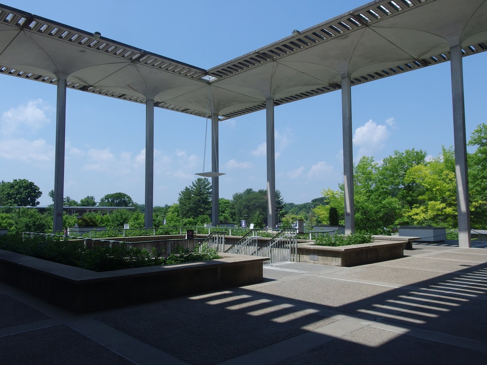
It is amazing to stand in the central courtyard and be surrounded by the Stone aesthetic. It's a lovely feeling that everything goes together. Not many architects get to shape a whole environment of buildings. The repetition of elements becomes a strong architectural statement.
That all being said, wayfinding is difficult when everything looks the same. To help people out, maps and signs are posted everywhere. This ultimately leads to a cluttered look. It's frustrating to see buildings age in this manner. I feel if architects want to control this better, they either have to make their layouts ridiculously simple, or build in more wayfinding tools/directional signage. Stone did have some wayfinding built in, but it needed more. A college where everything looks the same is inherently going to need more wayfinding tools than a college that has architecturally-diverse buildings.
Stone made the Academic Podium have covered paths so that students could walk outside in any type of weather. Nevertheless, New York winters can be brutal even without precipitation. You still have freezing temperatures and wind (which the colonnades are known to enhance). The utility tunnels, envisioned exclusively for service vehicle use, are now also used as pedestrian walkways. It feels like there was some misunderstanding of the local weather when the complex was being designed. It's a great campus, but this design would have been better if built somewhere warmer. While there are enclosed pedestrian-only paths built into the design, more of them would have improved campus usability in the winter months. This would have also ensured that the utility tunnels could remain exclusively auxiliary.
Utility tunnel at University at Albany. Big pipes!
The pedestrian path is on the right-hand side,
denoted by the yellow line.
Maintenance across the Podium varies. The more important locations are better taken care of than the off-the-beaten-path walkways and quads. This is even more apparent because everything looks the same. If one section's quality of care is at a lower level than others, it will stand out.
Landscaping also has struggling patches. I have found at a lot of places I have visited, landscape maintenance is seen as an afterthought, or is piecemeal. I believe that this is an incorrect way of thinking. Landscaping is just as integral to the experience as the building is. Modernist and Brutalist buildings don't always look good standing on their own. A little greenery can break up the starkness. It can make a place feel more alive. I think Albany should invest in a landscaping master plan.
Even if there are new plantings here, can anyone explain the
placements of the larger plants and rocks in this planter?
The two large courtyards on either end of the Podium, however, were well planted. I was especially surprised and delighted looking down one colonnade and seeing what looked like the edge of a forest growing inside the Podium.
Look at that forest! (I took a lot of shots down
the colonnades.)
Looking into a lush courtyard
I wrote earlier how I enjoyed campus's architectural cohesiveness. This does not include almost all of the expansions touching the Academic Podium and in close proximity to it. They stick out like sore thumbs. They either vaguely try to be similar to the original design, or do whatever they want. For such a highly-stylized campus that started with such a strong architectural identity, why would you add something that doesn't go along with the rest? It takes away some of that power.
Colleges, heed my words. You don't always need that new contemporary architectural style on campus. If your campus already has amazing architectural cohesion, fight against the temptation for that different style. It will all be worth it!
The one slight exception I found for an expansion was University Hall. This administration building, built in 2006, is right next to the main entranceway to the Podium. It is this wavy-mirror structure that is set on an angle from the Podium. It is intentionally not fitting in with Stone's design, while reflecting his design in its glass. I can grudgingly appreciate that. My only wish is that the building on the other side of the entranceway mirrored University Hall. Instead, the Massry Center for Business was built in 2013 with a different look.
University Hall (Left), Stone's SUNY Albany (Center),
and the Massry Center for Business (Right). I barely took
any shots of the expansions, I was not having it.
I have a lot of strong criticisms for this campus, but I don't want that to bury the fact that it is beautiful and I did enjoy walking around it.
Stone's style is on full display here. There are overhanging eaves with cut-outs everywhere. Hanging circular planters are present, but serve more as lighting than for holding plants. I even found some metal grillework in the central courtyard with a decorative pattern!
Fun grillework cover!
The columns are always the main stars here. Again, I really like that melting column look at the top. When there are rows of columns running parallel to each other, it creates this modern Gothic/Islamic architecture vibe.
Columns melting into the entranceway's ceiling
Another opportunity to give you a
looking-down-the-colonnade shot,
featuring the ceiling.
I have never seen anything like the columns in the library. One part melting column, one part sunburst light. They're a little strange, but I really like them. They seem like a maintenance nightmare, plenty of individual strands were out. It was a challenge to find a completely lit column to photograph.
Loved this aisle
Example of a column with unlit strands
Rare shot of two columns next to each other
all lit up
Sunburst Columns everywhere! It's really lovely.
The main fountain in the central courtyard is of note. It is a lovely, relaxing oasis on campus. The day I visited was very hot, so other people were sticking their feet in the water to cool down. The fountain was renovated 2012-2014, with a new jet design and walkway bisecting the pool. The renovation was designed by Stone Architects, LLC, led by Hicks Stone, Edward Durell Stone's son. Its use of angled lines give off its younger age, but it does very much fit in with the original design.
Central Fountain
I liked the boxed trees along the perimeter of the Podium. They reminded me of the ones that used to surround the Kennedy Center.
Boxed trees!
The Performing Arts Center was closed when I visited, so I have no comments on those spaces.
The 251-foot pillar in the central courtyard is actually a water storage tank with a carillon on top. It was awarded "Steel Tank of the Year" in 1968 by the Steel Plate Fabricators Association for being utilitarian and beautiful!
The prettiest water tower
I visited one of the four dormitory quads, the Colonial Quad. The quads are two stories tall (as opposed to the Academic Podium structures being three stories tall). In each of their courtyards is a 22-story dormitory tower.
A corner entrance to Colonial Quad.
The paint on those columns is ROUGH.
The two-story dorms match the style of the Podium. The towers are very bare & unadorned, which is unfortunately par for the course of Edward Durell Stone tower structures. They copy the wall façade used throughout SUNY Albany. Did not get to go inside any of the dorms, but peering through a window, the rooms look pretty college-standard to me.
Base of the tower. Accessibility is addressed through long
& short-term solutions. Being added in retroactively, the
ramps do not blend in well with the original design.
Corner Dorm Room
It's hard to find a bad angle here. Campus is really photogenic.
Corner of the Academic Podium
Looking at the entrance to SUNY Albany, featuring post-Stone water features
My final thoughts: Visit the University at Albany during the summer when everything is green and the fountains are on. Wear comfortable footwear to walk in. Soak in the Stone aesthetic while dipping your feet in the central fountain. You don't need to look at the expansions, you don't need to enroll/live there. Just get lost in the Academic Podium, and enjoy this architectural gem.